Python is a powerfull multipurpose programming language that can help us handle the statistical analysis of spatial data. By using python and jupyter notebook we can make a workflow that can be implemented on any problem set. Bunch of Packages have been written in Python by the community. One of the geostatistical packages that I think really good is pygeostat, because it can integrate GSLIB (Geostatistical Software Library) into the workflow. In this post, I would like to perform a cell declustering analysis using pygeostat and GSLIB in python.
# import modules packages to python
import pygeostat as gs
data = gs.DataFile('datafile.csv') # import data file and assign to a variable named `data`
data.setvarcols(variables=['Primary']) # Specify variables
data.setcol('cat', 'Batch') # Set Batch column as categorical datadata # View assigned data atributes DataFile: datafile.csv
Attributes:
x: ‘Xlocation’, y: ‘Ylocation’, cat: ‘Batch’,
Variables:
Primary
print(data.data) # View the data tableBatch Xlocation Ylocation Primary 0 1.0 39.5 18.5 0.06 1 1.0 5.5 1.5 0.06 2 1.0 38.5 5.5 0.08 3 1.0 20.5 1.5 0.09 4 1.0 27.5 14.5 0.09 .. … … … … 135 2.0 31.5 41.5 22.75 136 2.0 34.5 32.5 9.42 137 2.0 35.5 31.5 8.48 138 2.0 35.5 33.5 2.82 139 2.0 36.5 32.5 5.26
[140 rows x 4 columns]
data.describe() # View data summary statisticcount 140.000000 mean 4.350429 std 6.726625 min 0.060000 25% 0.700000 50% 2.195000 75% 5.327500 max 58.320000 Name: Primary, dtype: float64
# Make a location plot.
fig, ax = gs.subplots(nrows=1, ncols=2, cbar_mode='each', figsize=(18,18))           # Defining subplots configuration
_= gs.location_plot(data=data, var='Batch', ax= ax[0])                               # Location Plot by batch
_= gs.location_plot(data=data, var='Primary', ax = ax[1])                            # Locatioin Plot by Primary values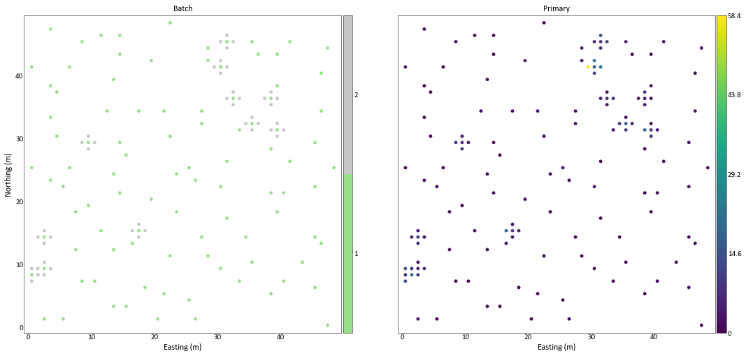
As we can see in the location plot above, there are 2 data batch. The first batch collect the data sparsely while the second batch data were collected to target high values near the prior data. The clustered data like this, will make spatial data statistics tends to be biased. Let’s check the significant changes of the data statistics bias by inspecting histogram.
# Plotting the histogram of Primary data variables foor each batch
_ = gs.histogram_plot(data=data, var='Primary',figsize=(12, 3), title='Primary values histogram (All Batch)')
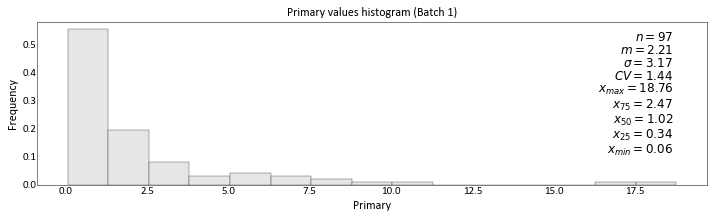
_ = gs.histogram_plot(data=data[data['Batch'] == 1], var='Primary',figsize=(12, 3),title='Primary values histogram (Batch 1)')
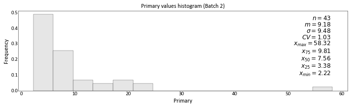
_ = gs.histogram_plot(data=data[data['Batch'] == 2], var='Primary',figsize=(12, 3), title='Primary values histogram (Batch 2)')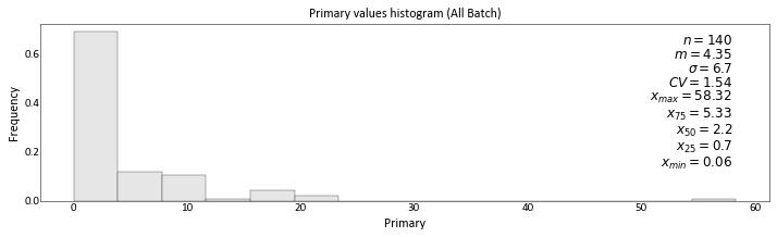
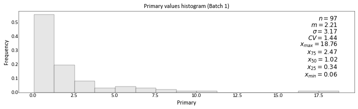
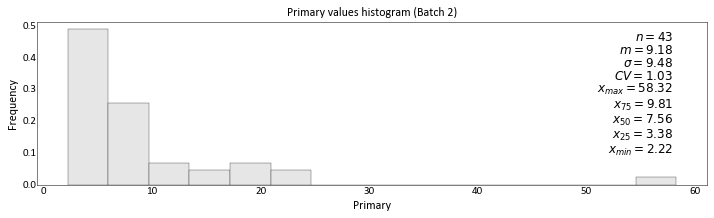
As we can see from the histogram, data from Batch 2 have a higher mean. When it is combined with data form Batch 1, the mean form the randomly sparse data, which is more reliable, are shifted. So, clustered data like this example, will tend to have a bias statistical summary, over-estimate or underestimate.
To account for this bias, we need to do a declustering routine to the data. Declustering is simply to assign weight to every data, so the statistical summary will be weighted. Declus.exe from GSLIB (Geostatistical Software Library) is a program to calculate Declustering weight. Here, I would like to perform Data Declustering using GSLIB program with help of pygeostat module to wrap the program, so it can be integrated to the workflow.
# Before running GSLIB program, the data need to be converted into GSLIB format
gs.write_gslib(data, flname='datafile.dat')
# Importing the program and get the parameter file
declus_p = gs.Program(program='declus.exe', getpar=True )C:\Python_Projects\Declustering\tmpholyux02\declus.par has been copied to the clipboard
By running the code above, the parameter string format automatically copied to the clipboard. Next, paste it into the next block.
parstr = """      Parameters for DECLUS
                  *********************

START OF PARAMETERS:
datafile.dat                -file with data
2   3   0   4               -  columns for X, Y, Z, and variable
-1.0e21     1.0e21          -  trimming limits
declus.sum                  -file for summary output
declus.out                  -file for output with data & weights
1   1                       -Y and Z cell anisotropy (Ysize=size*Yanis)
0                           -0=look for minimum declustered mean (1=max)
24  1.0  25.0               -number of cell sizes, min size, max size
5                           -number of origin offsets
"""
# Run the program and use the parameter specified above.
declus_p.run(parstr=parstr, liveoutput=True)Calling: [‘declus.exe’, ‘temp’]
DECLUS Version: 2.906
data file = datafile.dat
columns = 2 3 0 4
tmin,tmax = -1.000000E+21 1.000000E+21
summary file = declus.sum
output file = declus.out
anisotropy = 1.000000 1.000000
minmax flag = 0
ncell min max = 24 1.000000 25.000000
offsets = 5
There are 140 data with: mean value = 4.35043 minimum and maximum = .06000 58.32000 size of data vol in X = 48.00000 size of data vol in Y = 48.00000 size of data vol in Z = .00000
declustered mean = 2.52389 min and max weight = .28779 1.79745 equal weighting = 1.00000
DECLUS Version: 2.906 Finished
Stop - Program terminated.
As we can see abve, declustering process progress written neatly. Let’s open up output file and check the result.
declus_sum = gs.DataFile('declus.sum') # Importing declus.sum (summary of declustering process) # Plot the declus.sum, so we can inspect the lowest mean.
_ = gs.scatter_plot(x=declus_sum['Cell Size'], y=declus_sum['Declustered Mean'],
title='Declustered mean for each cell size',
c=declus_sum['Declustered Mean'],
stat_blk=False, ylim=(2,5), xlim=(0,26))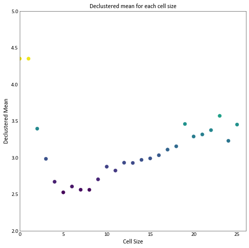
As we can see the lowest Declustered mean is around 2.5. Next, we are going to import the resulted data table and calculate histogram and its statistical summary.
declus_out = gs.DataFile('declus.out')               # Importing Declustering Output
print(declus_out.data)                               # View the data
Batch Xlocation Ylocation Primary Declustering Weight 0 1.0 39.5 18.5 0.06 1.281301 1 1.0 5.5 1.5 0.06 1.400103 2 1.0 38.5 5.5 0.08 1.613235 3 1.0 20.5 1.5 0.09 1.797446 4 1.0 27.5 14.5 0.09 1.430162 .. … … … … … 135 2.0 31.5 41.5 22.75 0.367498 136 2.0 34.5 32.5 9.42 0.417419 137 2.0 35.5 31.5 8.48 0.432717 138 2.0 35.5 33.5 2.82 0.336913 139 2.0 36.5 32.5 5.26 0.287790
[140 rows x 5 columns]
Note that Declustering Weight have been assigned to the table. So, we can use this weight to calculate unbiased summary statistics.
# Plotting the histogram of Primary data variables foor each batch
_ = gs.histogram_plot(data=data, var='Primary',figsize=(12, 3), title='Primary values histogram (All Batch)')
_ = gs.histogram_plot(data=data[data['Batch'] == 1], var='Primary',figsize=(12, 3),title='Primary values histogram (Batch 1)')
_ = gs.histogram_plot(data=data[data['Batch'] == 2], var='Primary',figsize=(12, 3), title='Primary values histogram (Batch 2)')

_ = gs.histogram_plot(data=declus_out, var='Primary', weights='Declustering Weight', color='lightblue' ,figsize=(12, 3), title='Primary values histogram (All Batch, Weighted)')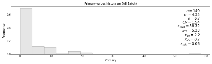
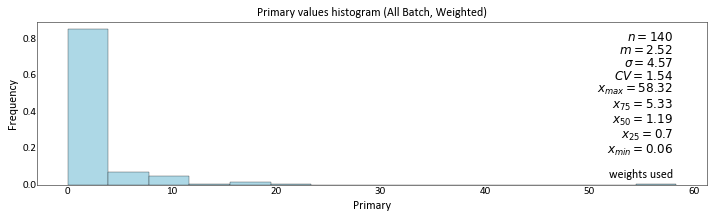
So, the unbiased declustered mean is 2.52, Note that the mean of raw data is 4.35 which is bias, overestimate.
Closing Remark
Almost every spatial data is biased, declustering process need to be accounted before another analysis or the decision made. By using GSLIB in python, we can build the workflow that suits of our project scale.
Reference
-
Deutsch, C. V., & Journel, A. G. (1998). GSLIB: Geostatistical software library and user’s guide. New York: Oxford University Press.
-
Pygeostat Documentation. http://www.ccgalberta.com/pygeostat/welcome.html